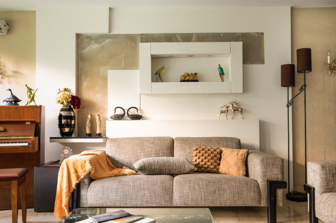
Gone are the days when ideas of success were a big house, 402 bathrooms and a perfectly manicured forest in your backyard.
As more and more people opt for smaller spaces in better areas, micro-living-friendly trends have taken the interior design world by a small—but mighty—storm.
The thinking behind micro-living is well-footed, kinder to your wallet and the planet. Still, there are design caution areas that even the most clued-up enthusiasts should know about so that your home actually feels like a home and not an overpacked suitcase.
Ready to turn your shoebox into a treasure chest? Here are 5 decor survival tips for micro-living:
1. Don’t crowd your walls to the point of no return
You have years of family photos that needed to go somewhere. Or maybe your own personal art gallery got a bit out of hand. However, the walls are closing in on you and you don’t actually have another room to go to. Help!
You want to keep your walls as minimalist as possible in a micro-living setting. Mirrors will create the illusion of space, and a feature wall is awesome. But as soon as every wall starts looking dramatic, you will start to feel enclosed, no matter how aesthetic it seemed at first.
2. Multipurpose furniture is a game-changer
What’s that? An ottoman that doubles as a storage unit? Or maybe a bed pull-out that can house all your photo albums. What about a low bookshelf that doubles as a desk? And never forget a good tuck! When it comes to micro-living, you need to be prepared to double and triple up on furniture so that you don’t waste space on unnecessary shelves or storage items.
Pro-Tip: Keep art or any slim accents you haven’t found a place for behind an angled mirror.
3. Let your colour scheme do the talking
You’re not going to have space for all the ornaments your heart desires. But you also don’t want your space to look tasteless and bland. Steer away from the boring aesthetic with a little help from your friend “a colour scheme.”
Using the 60-30-10 colour ratio, you can keep a minimalist feel and add all the vibes to your tiny haven in a way that says “creative.”
4. Vertical pieces to the rescue
You want your eyes to be drawn upward in a small space. These also free up room for more items where necessary. Get your vertical on with skinny lamps, Slender indoor plants and elevated side tables.
5. Be transparent and keep it light
Transparent furniture and accent pieces make subtle differences when it comes to how busy your home feels. We all love an iconic pattern, but sometimes too many patterns spoil the palette. Keep things light with soft pastel colours over darker, brooding schemes, unless you want your home to look like a lair.
ALSO SEE:
Feature Image: Pexels

