One of the most exciting aspects of home decor is the ever-evolving world of colour trends. The 2024 colours of the year are here, and the stunning new shades already have us swooning.
Each year, colour experts and designers carefully analyse cultural, societal and environmental influences to predict the colour trends that will dominate the coming year. In 2024, experts are expecting to see a shift towards colours that reflect a sense of calmness, and positivity and bring joy into our everyday spaces, while also appreciating nature’s earthy tones and textures.
We’re seeing people being drawn more to nature and those natural colours and textures, and that is what has inspired our 2024 colour forecast, says Plascon Colour Consultant Patty Mulauzi, featured on the Expresso Morning Show.
Colour is a language and as such plays an elemental role in personal self-expression.
When you redecorate, choose paint colours that complement each other – at the end of it all, the colours you choose should represent how you feel and make way for an energy you would like to invite into your space. ‘It’s all about bringing your personality into a space and feeling happy about it. Don’t be afraid to mix and match colours that wouldn’t traditionally work together, says Patty.
The 2024 colour forecast
Nurturing Greens
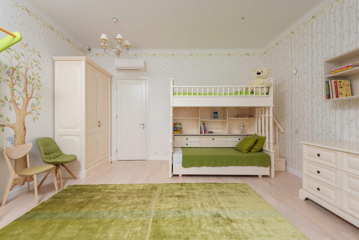
Shades of green take centre stage, reflecting our increasing awareness of environmental issues and our yearning for tranquillity. From earthy olive greens to soft sage and vibrant emerald, green hues evoke a sense of balance and connection with nature.
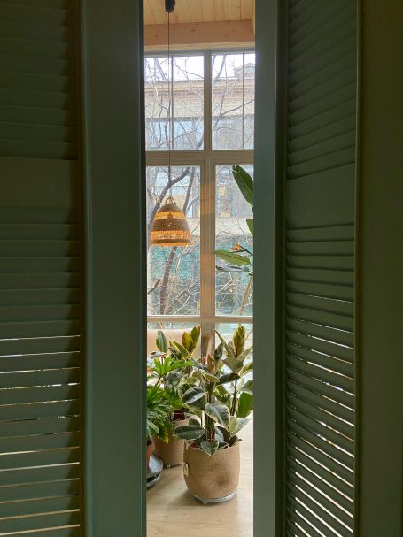
Image credit: Pexels
Serene Blues
Calm and soothing blues continue to be popular. Think soft baby blues, misty aquas, and deep oceanic blues that bring a sense of serenity and peace to your home and garden.
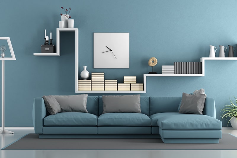
Image credit: Pexels
Earth Tones
Earthy and grounded colours such as terracotta, clay, and warm browns are gaining popularity. They provide a comforting, rustic feel and harmonise beautifully with natural textures and materials such as wood and stone.
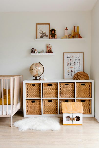
Image credit: Pexels
Sunny Yellows
Bright and optimistic, shades of yellow are making a comeback. These hues, from soft pastels to energetic sunflower yellows, infuse spaces with warmth, positivity and energy. “I am into the bright yellows and Plascon’s Sunkissed is a lovely sunny yellow that epitomises spring sun and is absolutely gorgeous and brings out the happiness in your space,” Patty adds.
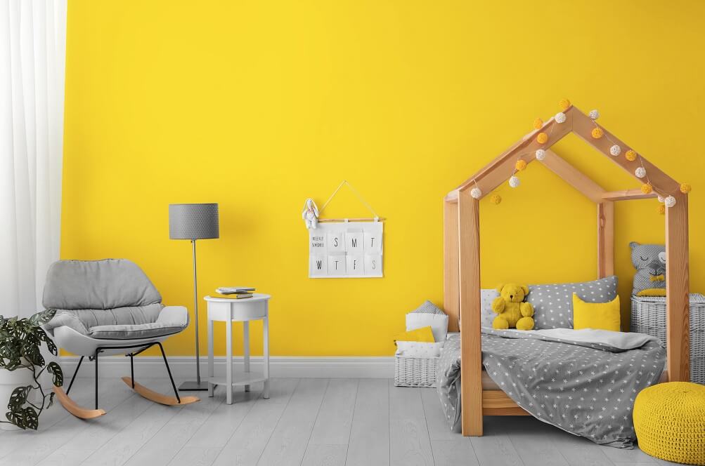
Image credit: Pexels
Soft pinks
Delicate blush pinks continue to be in vogue, adding a touch of elegance and femininity to interiors. If there’s any colour that could hug your home, it’s Sweet Embrace – Dulux Colour of the Year 2024. The pastel-pink shade, inspired by soft feathers and evening clouds, is perfect for creating the calm and welcoming spaces that so many of us crave.
“Our Colour of the Year 2024, Sweet Embrace is a delicate, welcoming, and soothing tone that brings a sense of stability and softness to a space. Sweet without being saccharine, it works beautifully as a stand-alone shade, and can also act as a positive foundation for a host of other shades. Working with the colours in our new palettes, offers a wealth of possibilities for our customers to create a space that feels just right for them,” says Dulux colour expert Palesa Ramaisa.
Using the 2024 colour palette in your home
Now that you’re acquainted with the colour trends, let’s explore how to incorporate them into your living spaces:
Painted Walls: A fresh coat of paint can transform any room. Consider using nurturing greens or serene blues for a calming bedroom, sunny yellows in a cheerful kitchen or earthy tones in a cosy living room. Soft pinks work wonders in nurseries or as accent walls.
Furniture and Decor: Introduce these trendy colours through furniture, cushions, throws and decorative items like vases, candles or artwork.
For example, a green velvet couch or blue accent chairs can add a touch of elegance and style.
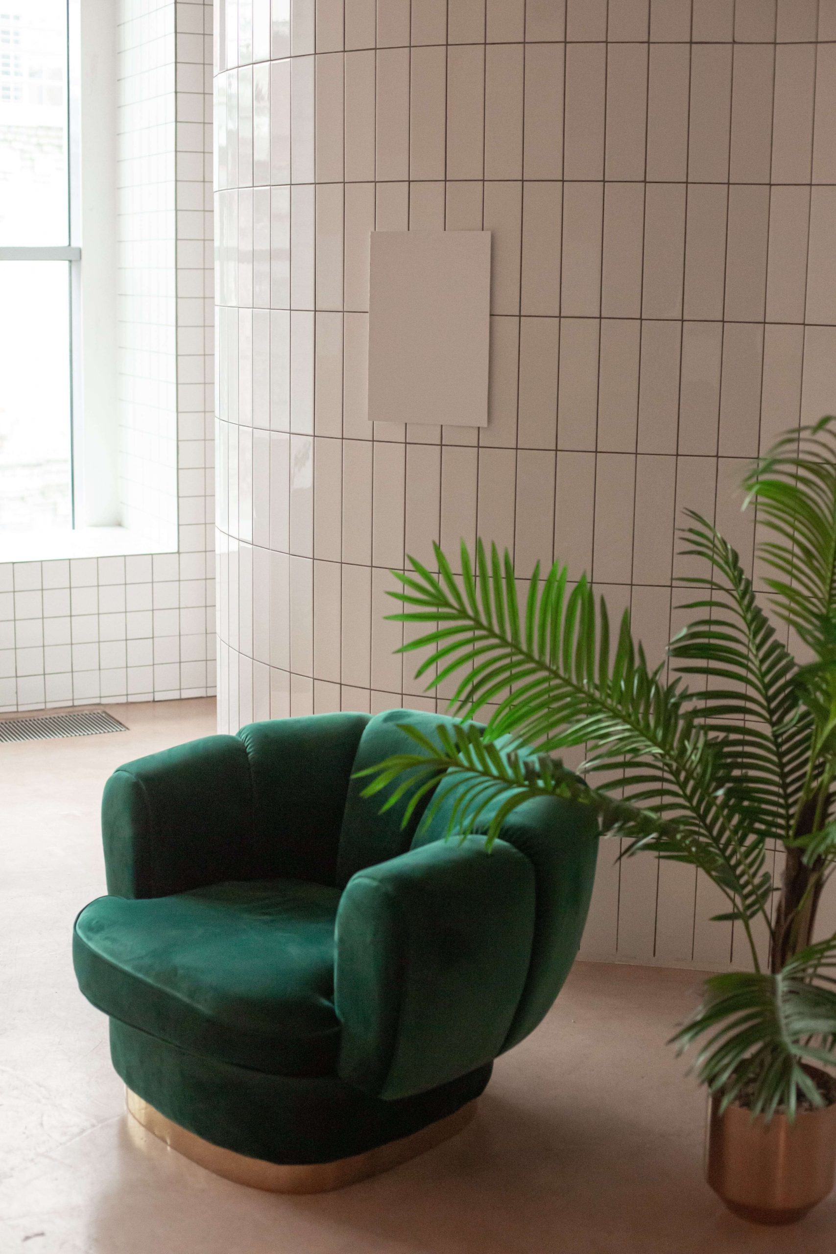
Image credit: Pexels
According to Patty, starting with a clean palette such as pastels and neutral colours is always a good idea when you’re not sure how to incorporate new colours into your space. Once you’ve chosen these colours, it gives you a canvas to work with and then you can bring in pops of colour. “I always encourage people to buy sample pots because it gives them a chance to test the colour in their space under the different lighting in their spaces.”

