Rome wasn’t built in a day and neither was an interior that flows without any furniture faux pas! We’ve all made home decor errors that don’t serve our space. In this article, we’ll cover some of the simplest design & decor mistakes one can make, and we’ll tell you how to fix them.
Let’s get to business!
Don’t follow trends too closely, look for timeless
Home decorating trends are always shifting and changing, that’s why it’s important to always keep an eye out for timeless pieces that will always have their spot in your home. Instead of opting for the latest pattern, print or colour that’s on trend, look for classic & timeless.
Getty
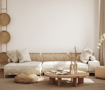
When you’re searching for a timeless piece, it’s smart to stay in a neutral colour zone – your nudes, whites, greys, and creams are softer and easier to work with in the long run. That doesn’t mean you should opt out of adding one or two accents to your decor but do so with items that can be swapped out easily. Such as scatter cushions or vases.
Avoid words in your wall art
We’ve lived, laughed, and loved enough. It’s time to ditch the wordy wall art for pieces that blend well with the space and your colour palette. Wordy prints can often feel like clutter, and make a room look juvenile.
Pexels
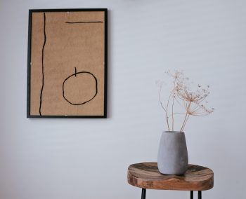
Cut back on the copy and focus on the colour and texture of your wall part. Another important element to consider is framing. Do you want your art piece to stand out in a black or gilded golden frame, or are you working with a more neutral colour palette that would complement a natural wood frame more?
Don’t display mass-produced art
Mass-produced prints/artwork bought from a nationwide retailer is the easiest way to make your space look and feel outdated. Just picture how many people have the same piece of art hanging above their bed. Instead, make the space your own, with artwork that appeals to you.

Getty
If you can’t afford to support a local artist, you could always try your hand at painting or drawing the artwork yourself. A touch of personable creativity can really make a space feel like your own.
Do away with doom piles & clutter
When life gets busy, clutter gets crazy. Nothing can drown your space out quite like clutter does. If you’re proactive about your clutter-creating habits, there are ways to work around it and keep your space looking neat and tidy.
Getty
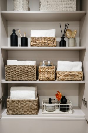
Your solution is storage baskets & boxes! If your cupboards or shelves tend to get cluttered, incorporating storage elements to place things in can minimise the eye sore. If you’ve got open shelves, go for woven baskets with a neutral tone that complements your colour palette.
Don’t dismiss the power of a colour palette
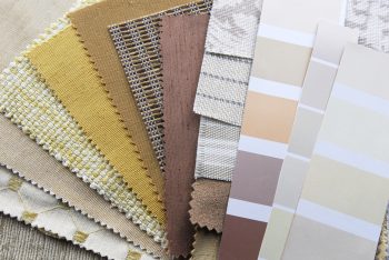
Don’t go on a homeware haul and neglect to think of your colour scheme and how you’re going to build on it! We’ve made the mistake of picking up decor items we love and then arriving home to realise that nothing matches or works together. It’s important to plan your palette ahead of time.
Getty
We’d advise building from a base of neutral colours. The basics, like your walls, furniture, and lighting should all blend well together. If you’d like your space to flow, plan ahead by looking at colour swatches, and matching colours that work well together, but don’t go too bold!
Don’t overdo the neutral either…
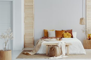
Focus on those neutral tones, but not everything should be one straight colour or hue thereof. This can leave a space feeling underwhelming and incomplete. It’s good to incorporate colour and texture that breaks up the uniformity of an all-neutral palette.
Getty
Do so by considering textured elements, too. A chunky throw, a blocky scatter, or a woven basket can do so much to highlight and accent the rest of your decor. Waffled fabrics are also another great option when you’re looking to incorporate more texture.
Your furniture shouldn’t cramp your space
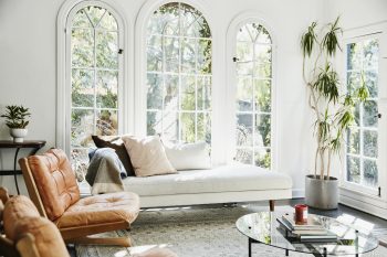
Be mindful of how your furniture fits the area. If you’ve only got a little space to work with, a large, bulky corner unit is probably going to overwhelm the area. Instead, go for a comfortable single-unit piece.
Getty
Think about other furniture items like TV units and how they will fit the area. Don’t make the mistake of buying a unit that is too small for your TV. If your TV just fits the unit without any room to breathe on either side, this will make the space feel cramped. Give elements in your home room to breathe. The bigger they are, the more space they will need.
Don’t only go for angular…
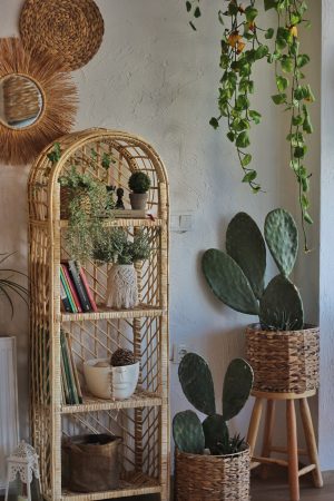
One thing that easily overwhelms an area and makes it look rough around the edges is only using angular furniture. The blockiness about it creates a sharpness that doesn’t blend with the flow of a space. This takes away from the ‘feng shui’ element you should be after.
Pexels
Look for furniture with a rounded element. Planters, shelves, coffee tables, lamps, poufs, pillows, and vases. Elements that have a nice curve will harshen the blow in a space where most other things are angular.
ALSO SEE:
Go big or go home with bold marble – decor’s statement stone
Feature Image: Getty

